Courtney Dootson
Graphic Design Student
Tutorials
 |  |  |  |  |  |  |
|---|
Milton Glaser Tutorial
To create the Milton Glaser experiments, I started off by using Illustrator and outlined one of my primary images to get a silhouette effect. Then I covered the silhouette with the brush tool in black and then used another primary image, which was a texture, and outlined it. Once everything was outlined, I moved the illustration into Photoshop and used colours that Milton Glaser uses in his work. To colour it in, I used the magic wand tool, selected what I wanted to select and used the fill tool. I near enough did this with every experiment I did for the Milton Glaser designs and again, I'm really pleased with my final outcomes; I would like to use some of these designs for my clothing brand.
 |  |  |  |  |  |
|---|
Pilar Zeta Tutorial
To create these Pilar Zeta experiments, I used my traditional work and added brush strokes in Photoshop to make a splattered paint effect. I then added my primary imagery of the sky and adjusted it to black and white. Furthermore, I added another one of my images, rubbed away anything I didn't want and layered it on half the side of the other image. I then duplicated it and layered the image on the other side and to finish it off, I adjusted it to black and white, then added upside down triangle and a thin rectangle to finish the piece. Again, I near enough used the same steps for each to create a universal look. To be honest, I would like to use some of the experiments, but not all of them because they're not as good.

Nadia flowers Tutorial
To create the Nadia Flowers experiments, all I did was drew what came into mind and be inspired by her work. I did typography, typography with imagery or just imagery itself. I thought of creating my own character of an eye with ears, hands and legs. To be honest, I would like to add the different designs in my work because I love the variety of designs I've thought of and I enjoyed drawing them.
 |  |  |  |  |  |
|---|
Keith Haring Tutorial
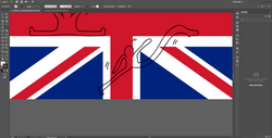
To create the Keith Haring experiments, I used Illustrator to outline the union flag and to draw little people having fun. To colour it in, I went to Photoshop and used the magic wand to select what I need and used the fill tool to colour it all in. I did the same method for the other designs I did, and to be honest, It fun and interesting so I would like to add the design in my branding work. In my opinion, I thought it was good to practice illustration and it would look really good for promoting my work.