Courtney Dootson
Graphic Design Student
Typeface development

Idea 1
This idea is an original type of typography, which is keeping it professional and classy. I have used other types of fonts to see which one is suitable for the final outcome. To be honest, even though it looks basic and depending on which type of font I use, it could actually grab peoples' attention like big brands Chanel, Dior etc. They used a simple way to promote their brand and that was by making a logo that states who they are and what they create.

Idea 2
In my opinion, this type of typeface is quite different to the others and I think it shows character even if it is just basic, but it looks interesting and I hope my peers realise that it may be better than the other designs that I have chosen. However, is it good to be my logo design and can you see what it says clearly? Again, I used the same fonts so I can choose which one seems better than the other fonts; It shows what helps the typography stand out meaning what will help my brand stand out.

Idea 3
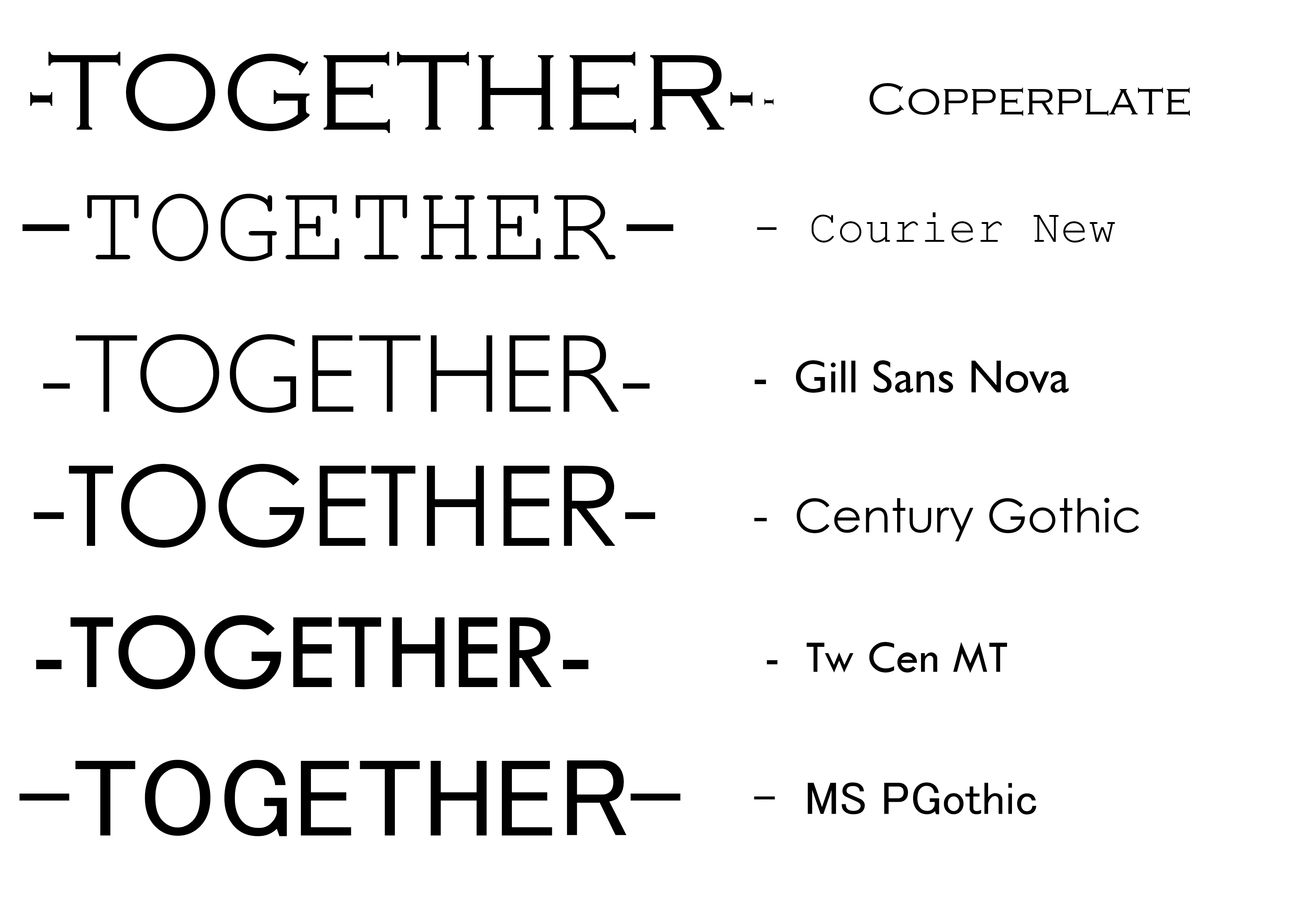
I used idea 1 and applied little lines on each side to create a different design, but to be honest it looks more boring than what I expected. The only design in this piece, that I think is alright, is the Gill Sans Nova. I think it just first together perfectly and it doesn't take up that much space. Others may like this design, but I know it was better than the other designs that I thought and in this group, it isn't my favourite. It reminds me of my first project in the beginning of the first year.

Idea 4
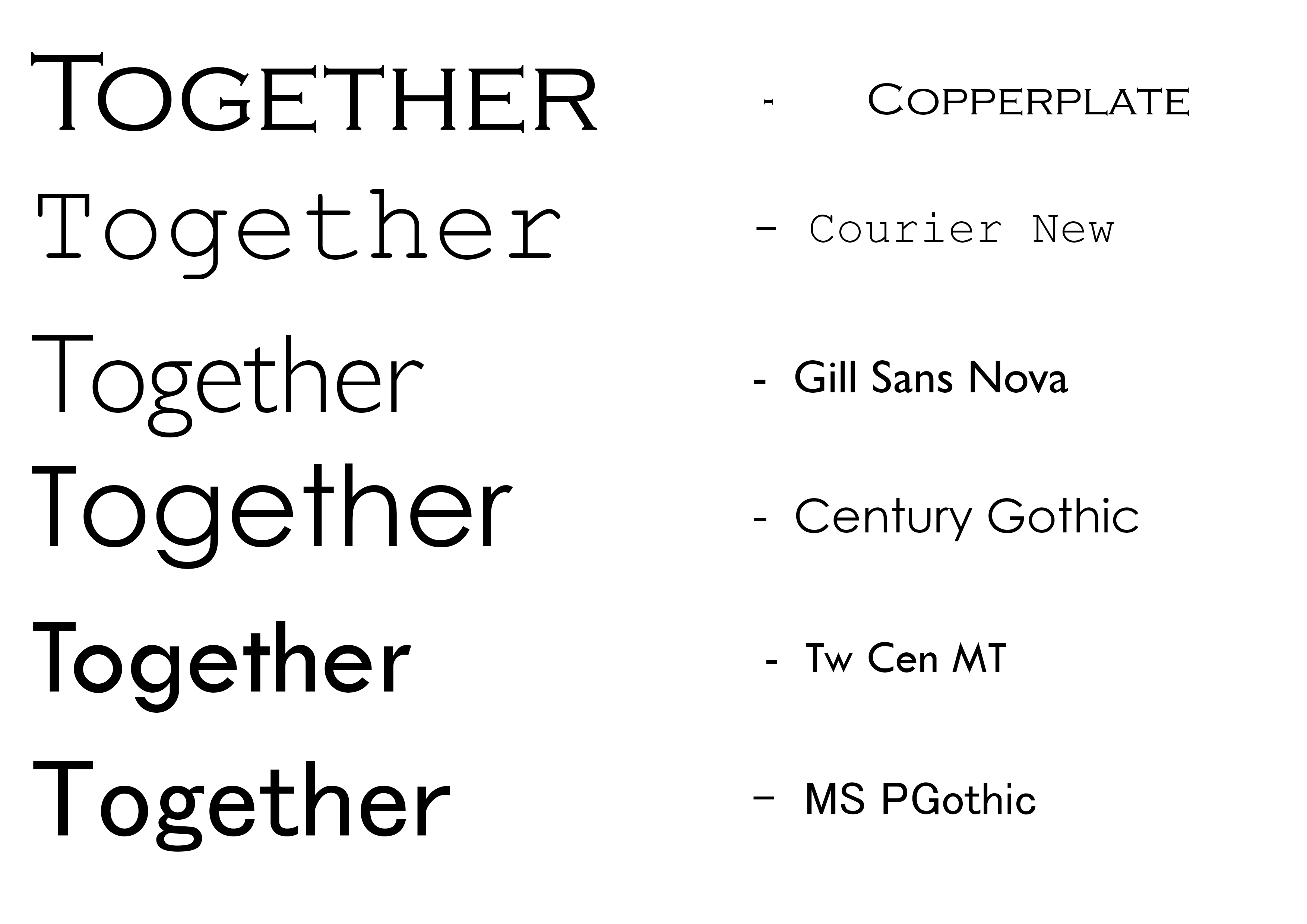
In this idea, I used idea 1 and used the lower case than using the upper case again to see if it looks better and worse than upper case. The copperplate font is just the same as idea one, but the other designs look alright. On the other hand, using the lower case makes it look more plain than they already were; if I used this idea, then I would need to put some colour or more designs into it because it isn't that great on its own. I think if I did use this design, I would choose the century gothic font as it's not too bold, but you can see it.

Idea 5
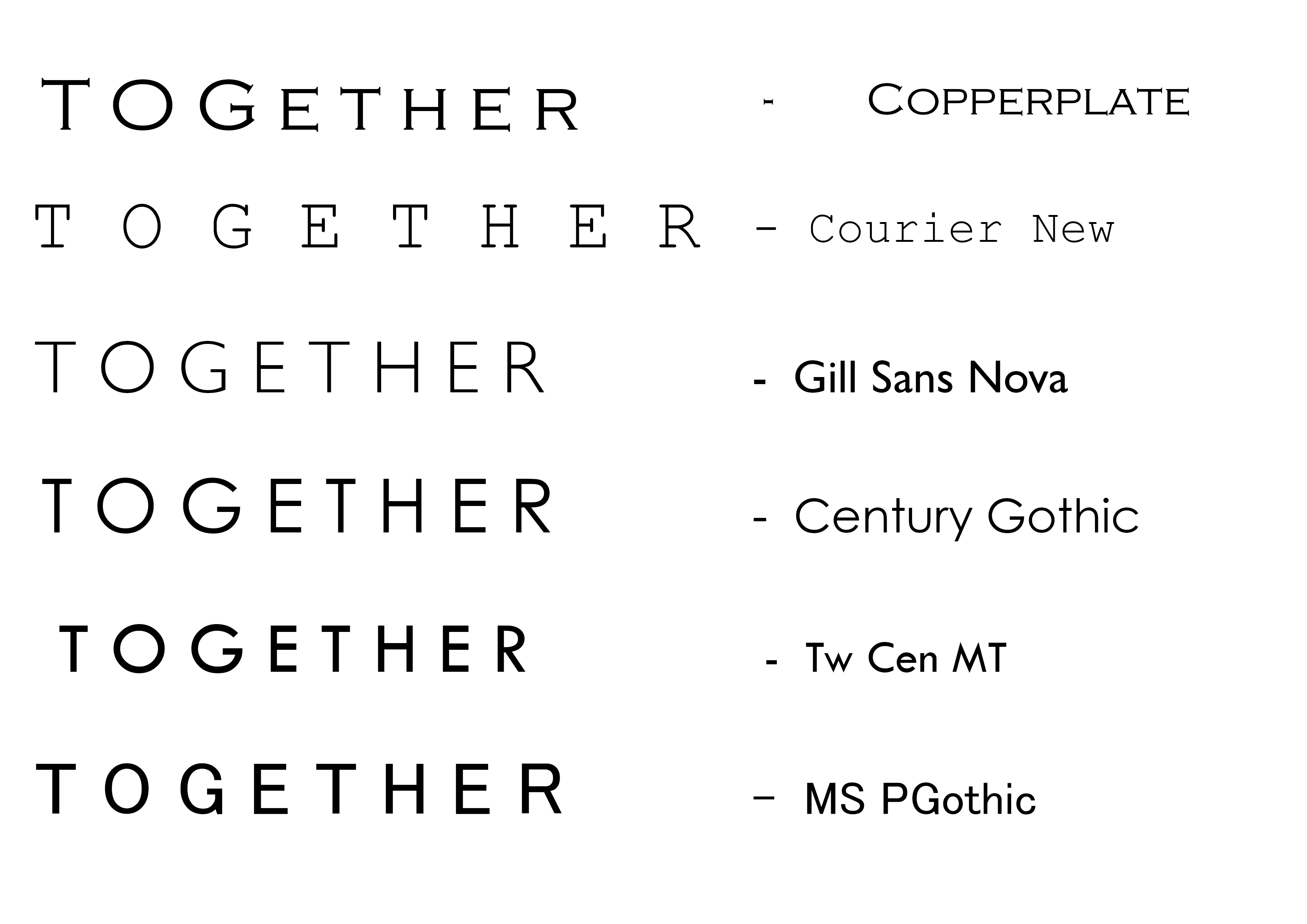
I think this I my favourite as well because the space between the letters see a clearer view of what it is and to me is stands out more. The best to use out of these ideas are the fonts Courier New and Gill Sans Nova because they're bold, but not over the top and I just think they look right overall. As I've said all of them are basic, but I want it professional and let the clothes speak for the brand.